Summer Color Harmony Bundle: Cool Palette Made Easy
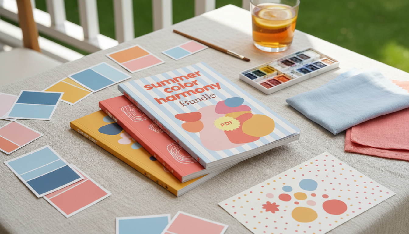
Summer Color Harmony Bundle: Build a Cool, Bright, Balanced Palette
The Summer season in color analysis is known for cool undertones, softened contrast, and clear-to-muted brightness. The Summer Color Harmony Bundle | summer season colors 3-in-1 Digital Guides is a 3-in-1 digital set designed to translate those traits into repeatable outfit, makeup, and accessory decisions—so colors feel cohesive across everyday looks, workwear, and special occasions.
Color harmony isn’t about restricting choices; it’s about choosing versions of colors that cooperate. When undertone, depth, and contrast work together, outfits look intentional with less effort—especially when shopping quickly online or trying to build a small mix-and-match wardrobe.
What “Summer” Color Harmony Means (and Why It Works)
Summer harmony centers on a refined, airy effect rather than sharp contrast. These are the traits that make the palette feel balanced:
- Core traits: cool-leaning undertone, medium-to-low contrast, and a softened (not harsh) overall effect.
- Harmony goal: create outfits where no single color overwhelms—everything blends in a polished, watercolor way.
- Common visual markers: greyed pastels, watercolor brights, cool neutrals, and gentle transitions between shades.
- Most flattering results: repeat similar depth levels (often light-to-medium) and keep contrast controlled.
If you like the idea of “quietly put-together” color, Summer harmony is built for it. For deeper color theory background, authoritative references like the Encyclopaedia Britannica overview of color and the International Commission on Illumination (CIE) help explain how color is measured and perceived.
What’s Inside the 3-in-1 Digital Guides
This bundle is structured to make color decisions repeatable, not random—so you can plan outfits faster and shop with fewer “almost works” purchases.
- Palette guidance for Summer-leaning colors: how to choose shades that stay cool and balanced.
- Practical outfit-building frameworks: easy combinations for tops, bottoms, layers, and accessories.
- Color pairing strategies: how to mix analogous and softly-contrasting colors without creating harsh edges.
- Quick-reference approach: scannable guidance for faster shopping decisions and closet planning.
- Digital format benefits: searchable and easy to revisit while shopping online or organizing a wardrobe.
For additional inspiration when you’re matching color to seasonal wearability, the Pantone Color Institute is a useful source for seeing how cool hues evolve across trend cycles—helpful when you want “current” colors without drifting warm.
Summer Subtypes at a Glance: Light, True, and Soft
Many Summer palettes fit into one of three subtype leanings. Knowing your “direction” helps you choose the right depth and softness without overthinking.
- Light Summer: lighter value, cool and airy; outfits look best when they stay brightened and gentle rather than deep.
- True (Cool) Summer: the coolest Summer expression; often shines in crisp cool hues that remain slightly softened.
- Soft Summer: most muted; looks cohesive with dusty shades and low-contrast combinations.
- When unsure: start with universally Summer-leaning colors (cool medium blues, soft teal, rose, lavender, cool taupe) and adjust by depth and mutedness.
Summer Subtypes and Color Tendencies
| Subtype | Best Color Qualities | Easy Starting Colors | Contrast Level |
|---|---|---|---|
| Light Summer | Cool, light, softly clear | Powder blue, light periwinkle, cool pink, soft mint | Low |
| True (Cool) Summer | Cool, balanced, refined softness | Cornflower blue, cool navy, raspberry rose, blue-based plum | Low to medium |
| Soft Summer | Cool-neutral, dusty, muted | Mauve, slate blue, soft teal, mushroom taupe | Low |
Color Pairing Formulas That Keep Summer Looks Polished
Summer palettes look best when transitions feel smooth. These formulas help build outfits that read cohesive (not “color-blocked”).
- Monochrome gradient: wear 2–3 shades of the same hue (light denim + medium blue + cool navy) to keep the look sleek and continuous.
- Analogous blend: choose neighboring hues (blue + blue-green + green) in similar depth for a calm, coordinated feel.
- Soft complementary accent: pair a main hue with a gentler opposite (dusty rose with soft teal) while keeping saturation moderated.
- Neutral anchoring: cool neutrals (soft white, dove gray, cool taupe, charcoal) keep outfits from feeling too sweet or too bright.
- Texture as contrast: when colors stay low-contrast on purpose, add interest through fabric texture, knit/weave, or subtle patterning.
Closet Planning: Building a Small Summer Palette That Mixes Easily
A small, consistent palette makes getting dressed easier because nearly everything “talks” to everything else. A simple approach:
When heat and humidity are part of the equation, color harmony is even easier when the fabric feels good. Pair the palette planning above with Summer-Friendly Fabrics | Practical eBook Guide to Breathable Fabrics for Summer, Stay Cool, Comfortable & Stylish in Hot Weather to keep cool-toned outfits comfortable in real summer weather.
Makeup, Hair, and Accessories: Keeping the Overall Effect Cool and Soft
Using the Digital Guides While Shopping (Online or In-Store)
Summer Color Harmony Bundle | summer season colors 3-in-1 Digital Guides
Shop the Summer Color Harmony Bundle and keep the guide open on your phone for quick checks while browsing colors, prints, and accessories.
FAQ
How can Summer colors look vibrant without feeling too bright?
Choose cool hues with softened saturation (slightly greyed) and keep the overall contrast low. Add vibrancy through one controlled accent color, interesting texture, or a lighter value rather than neon intensity.
What are the easiest Summer neutrals to start with?
Soft white, dove gray, cool taupe, and cool navy are reliable starting points. Pick two that match your lifestyle (for example, navy + cool gray for workwear) and then rotate in blues, roses, and teals as supporting colors.
Can a Summer palette include black?
True black often reads too harsh against Summer softness, especially near the face. Charcoal, soft navy, or smoky gray usually harmonize better; if wearing black, soften it with cool light colors (like soft white or powder blue) close to your face.









Leave a comment